Unfortunately, many dashboards miss the mark, overwhelming users with cluttered visuals and disjointed data.
(View Highlight)
An effective dashboard is more than just a visual display; it’s a strategic tool that helps you interpret the numbers, allowing you to make informed decisions with confidence.
(View Highlight)
Data Visualization & Dashboard Design Process by Seoyeon Jun (Author)
A clear purpose is the cornerstone of any effective dashboard. Without a well-defined goal, your dashboard risks becoming just another data dump. The objective is to create visualizations that direct users toward actionable conclusions. This is achieved by making it easy to compare, analyze, and interpret the data. (View Highlight)
To get started, ask yourself these critical questions:
1. Who: Who is the intended audience for this dashboard? Understanding your audience is crucial to tailoring the design to their needs.
2. Why: Why does this audience need to see this data? What decisions are they trying to make?
3. What: What key metrics will provide the insights needed to support those decisions?
4. How: How will the audience use this dashboard? Will it be for high-level monitoring, or will they need to drill down into the details?
5. When: When will this dashboard be used? Will it be referenced daily, weekly, or only in specific situations?
6. Design : How should the dashboard be structured to logically guide users through the data? (View Highlight)
Monitoring Dashboards for Managers:
Weekly KPI Dashobard by Seoyeon Jun (Author)
• Purpose: Provide an overview of business performance.
• Metrics: Focus on Key Performance Indicators (KPIs) such as sales, profit, and expenses.
• Example: A dashboard showing sales performance across regions with metrics like total sales, profit margins, and sales targets. This type of dashboard is ideal for quick, high-level monitoring. (View Highlight)
2. Actionable Dashboards for Marketing Teams:
Promotion Dashobard by Seoyeon Jun (Author)
• Purpose: To facilitate root cause analysis and guide actions.
• Metrics: Drill-down KPIs, such as sales performance by product or customer segment.
• Example: A dashboard that breaks down sales performance by product category, brand, or promotional campaign. This dashboard allows users to analyze the effectiveness of different strategies and take immediate action based on the insights.
By tailoring your dashboard to the specific needs of its users, you ensure that it serves its purpose effectively, whether that’s providing a snapshot of business health or driving operational decisions. (View Highlight)
2. Why: Understanding the Impact
2. Why: Understanding the Impact
• Importance: Is it directly tied to key business objectives such as revenue, retention, or customer acquisition?
• Context: How does the data align with current priorities? Is now the right time to focus on these metrics?
• Resources: What resources are required to collect and present this data? Is it worth the investment?
• Impact: Will this data lead to actionable insights, or will it merely add complexity? (View Highlight)
3. What: Choosing the Right Metrics
3. What: Choosing the Right Metrics
Not every metric deserves a spot on your dashboard. Prioritize those that provide clear insights and lead to meaningful actions:
Relative Metrics: Show change over time or across categories, helping you track trends and spot patterns.
Examples : Year-over-Year Revenue Growth, Sales Growth Rate Compared to Category AverageProportional Metrics: Illustrate the relationship between different data points.
Examples : Customer Retention Rate, Active User Ratio.Actionable Metrics: Focus on metrics that drive specific actions, often serving as leading indicators for key business outcomes.
Examples : Paid Subscription Conversion Rate, Ad Click Conversion Rate. (View Highlight)
4. How : Extracting Insights Through Comparison
The power of data visualization lies in its ability to facilitate comparisons. By comparing metrics, users can more effectively interpret the data and derive meaningful insights.
(View Highlight)
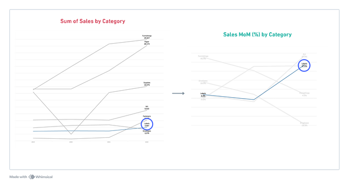
• Converting to Ratios: When metrics vary significantly in scale, converting them to ratios can help users make more meaningful comparisons.
(View Highlight)
Comparing with Averages and Similar Categories: Benchmark your metrics against overall averages or similar categories to evaluate performance. (View Highlight)
5. When : Timing is Everything
Choosing the right time frame for your data is crucial for generating meaningful insights. Depending on the dashboard’s purpose, you might select different time scales:
• Hourly: Ideal for real-time monitoring, such as tracking service usage or system performance.
• Daily: Useful for addressing immediate business needs, like order volume monitoring.
• Weekly: Common for standard dashboards monitoring campaign efficiency or user engagement.
• Monthly: Best for strategic reviews, such as assessing financial health during executive meetings. (View Highlight)
Once the purpose is clear and the metrics are selected, the next step is to structure the dashboard in a way that guides users logically through the data.
(View Highlight)
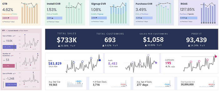
Key Performance Indicators (KPIs)
• Positioning : Place KPIs at the top of your dashboard. These are the most critical metrics that reflect the overall health of your business, such as monthly revenue trends or customer acquisition costs.
• Examples of KPIs : (View Highlight)
2. Data Overview
Data Overview
• High-Level Visualization: Use visual elements like funnel charts or treemaps to provide a broad overview of trends before users delve into specific details.
• Examples of Overview : (View Highlight)
In-Depth Analysis
Layered Analysis: Structure your analysis in layers:
First Layer: Focus on driver metrics that influence your KPIs, such as lead conversion rates if your KPI is overall sales.
Second Layer: Drill down into input metrics, such as website traffic or click-through rates, which affect your driver metrics.
Examples of In-Depth Analysis : (View Highlight)
Data Range Filter of Digital Ads Performance Dashboard (By Seoyeon Jun)
Ensure that users can interact with these sections, filtering and drilling down into the data as needed.
(View Highlight)
Actionable Insights
• Direct Connection: Dedicate a section to linking data with potential actions. Highlight areas that require attention and suggest recommendations based on observed trends.
• Examples of Actionable Insights : For example, you might include a table on the RFM Dashboard that displays only the customers from a specific segment for targeted marketing, or a table on the Sales Pipeline Dashboard that highlights the top-priority sales opportunities to focus on over the next 90 days. (View Highlight)
6. Detailed Data
• Granular Access: Provide a section for detailed, row-level data for users who need to conduct more in-depth analysis. This could include exportable tables or specific datasets for further manipulation.
• Examples of Detailed Data : (View Highlight)

 (View Highlight)
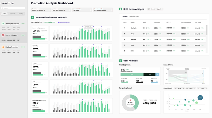 (View Highlight)
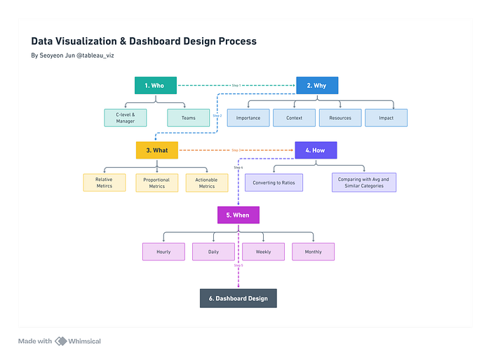 Data Visualization & Dashboard Design Process by Seoyeon Jun (Author)
A clear purpose is the cornerstone of any effective dashboard. Without a well-defined goal, your dashboard risks becoming just another data dump. The objective is to create visualizations that direct users toward actionable conclusions. This is achieved by making it easy to compare, analyze, and interpret the data. (View Highlight)
Data Visualization & Dashboard Design Process by Seoyeon Jun (Author)
A clear purpose is the cornerstone of any effective dashboard. Without a well-defined goal, your dashboard risks becoming just another data dump. The objective is to create visualizations that direct users toward actionable conclusions. This is achieved by making it easy to compare, analyze, and interpret the data. (View Highlight)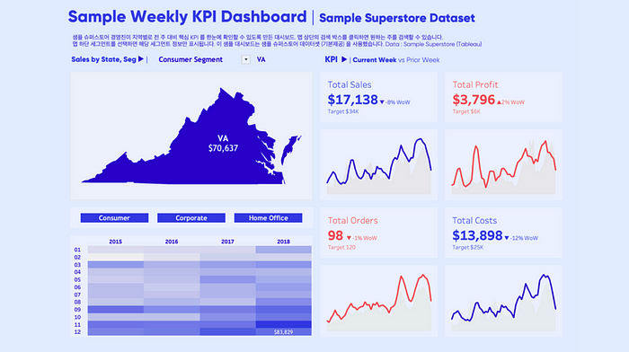 Weekly KPI Dashobard by Seoyeon Jun (Author)
• Purpose: Provide an overview of business performance.
• Metrics: Focus on Key Performance Indicators (KPIs) such as sales, profit, and expenses.
• Example: A dashboard showing sales performance across regions with metrics like total sales, profit margins, and sales targets. This type of dashboard is ideal for quick, high-level monitoring. (View Highlight)
Weekly KPI Dashobard by Seoyeon Jun (Author)
• Purpose: Provide an overview of business performance.
• Metrics: Focus on Key Performance Indicators (KPIs) such as sales, profit, and expenses.
• Example: A dashboard showing sales performance across regions with metrics like total sales, profit margins, and sales targets. This type of dashboard is ideal for quick, high-level monitoring. (View Highlight)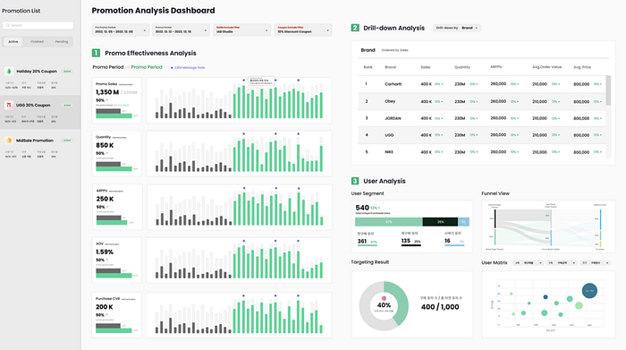 Promotion Dashobard by Seoyeon Jun (Author)
• Purpose: To facilitate root cause analysis and guide actions.
• Metrics: Drill-down KPIs, such as sales performance by product or customer segment.
• Example: A dashboard that breaks down sales performance by product category, brand, or promotional campaign. This dashboard allows users to analyze the effectiveness of different strategies and take immediate action based on the insights.
By tailoring your dashboard to the specific needs of its users, you ensure that it serves its purpose effectively, whether that’s providing a snapshot of business health or driving operational decisions. (View Highlight)
Promotion Dashobard by Seoyeon Jun (Author)
• Purpose: To facilitate root cause analysis and guide actions.
• Metrics: Drill-down KPIs, such as sales performance by product or customer segment.
• Example: A dashboard that breaks down sales performance by product category, brand, or promotional campaign. This dashboard allows users to analyze the effectiveness of different strategies and take immediate action based on the insights.
By tailoring your dashboard to the specific needs of its users, you ensure that it serves its purpose effectively, whether that’s providing a snapshot of business health or driving operational decisions. (View Highlight)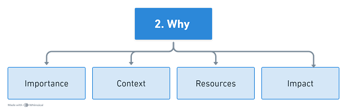 2. Why: Understanding the Impact
• Importance: Is it directly tied to key business objectives such as revenue, retention, or customer acquisition?
• Context: How does the data align with current priorities? Is now the right time to focus on these metrics?
• Resources: What resources are required to collect and present this data? Is it worth the investment?
• Impact: Will this data lead to actionable insights, or will it merely add complexity? (View Highlight)
2. Why: Understanding the Impact
• Importance: Is it directly tied to key business objectives such as revenue, retention, or customer acquisition?
• Context: How does the data align with current priorities? Is now the right time to focus on these metrics?
• Resources: What resources are required to collect and present this data? Is it worth the investment?
• Impact: Will this data lead to actionable insights, or will it merely add complexity? (View Highlight)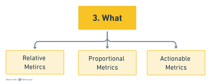 3. What: Choosing the Right Metrics
Not every metric deserves a spot on your dashboard. Prioritize those that provide clear insights and lead to meaningful actions:
Relative Metrics: Show change over time or across categories, helping you track trends and spot patterns.
Examples : Year-over-Year Revenue Growth, Sales Growth Rate Compared to Category Average
Proportional Metrics: Illustrate the relationship between different data points.
Examples : Customer Retention Rate, Active User Ratio.
Actionable Metrics: Focus on metrics that drive specific actions, often serving as leading indicators for key business outcomes.
Examples : Paid Subscription Conversion Rate, Ad Click Conversion Rate. (View Highlight)
3. What: Choosing the Right Metrics
Not every metric deserves a spot on your dashboard. Prioritize those that provide clear insights and lead to meaningful actions:
Relative Metrics: Show change over time or across categories, helping you track trends and spot patterns.
Examples : Year-over-Year Revenue Growth, Sales Growth Rate Compared to Category Average
Proportional Metrics: Illustrate the relationship between different data points.
Examples : Customer Retention Rate, Active User Ratio.
Actionable Metrics: Focus on metrics that drive specific actions, often serving as leading indicators for key business outcomes.
Examples : Paid Subscription Conversion Rate, Ad Click Conversion Rate. (View Highlight)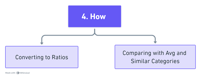 4. How : Extracting Insights Through Comparison
The power of data visualization lies in its ability to facilitate comparisons. By comparing metrics, users can more effectively interpret the data and derive meaningful insights.
4. How : Extracting Insights Through Comparison
The power of data visualization lies in its ability to facilitate comparisons. By comparing metrics, users can more effectively interpret the data and derive meaningful insights.
 (View Highlight)
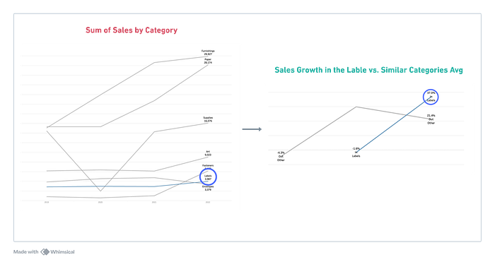 (View Highlight)
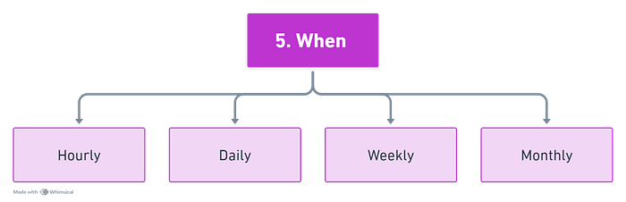 5. When : Timing is Everything
Choosing the right time frame for your data is crucial for generating meaningful insights. Depending on the dashboard’s purpose, you might select different time scales:
• Hourly: Ideal for real-time monitoring, such as tracking service usage or system performance.
• Daily: Useful for addressing immediate business needs, like order volume monitoring.
• Weekly: Common for standard dashboards monitoring campaign efficiency or user engagement.
• Monthly: Best for strategic reviews, such as assessing financial health during executive meetings. (View Highlight)
5. When : Timing is Everything
Choosing the right time frame for your data is crucial for generating meaningful insights. Depending on the dashboard’s purpose, you might select different time scales:
• Hourly: Ideal for real-time monitoring, such as tracking service usage or system performance.
• Daily: Useful for addressing immediate business needs, like order volume monitoring.
• Weekly: Common for standard dashboards monitoring campaign efficiency or user engagement.
• Monthly: Best for strategic reviews, such as assessing financial health during executive meetings. (View Highlight)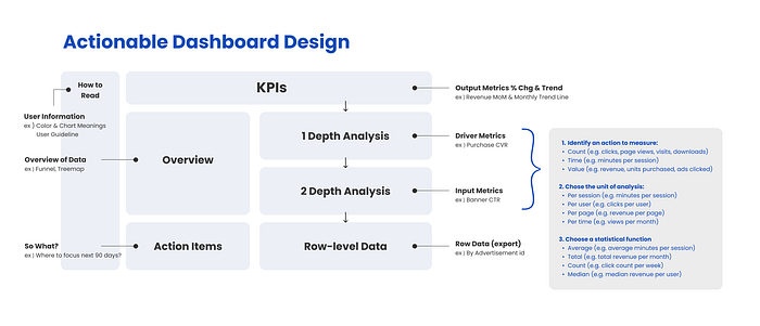 (View Highlight)
 Key Performance Indicators (KPIs)
• Positioning : Place KPIs at the top of your dashboard. These are the most critical metrics that reflect the overall health of your business, such as monthly revenue trends or customer acquisition costs.
• Examples of KPIs :
Key Performance Indicators (KPIs)
• Positioning : Place KPIs at the top of your dashboard. These are the most critical metrics that reflect the overall health of your business, such as monthly revenue trends or customer acquisition costs.
• Examples of KPIs :
 (View Highlight)
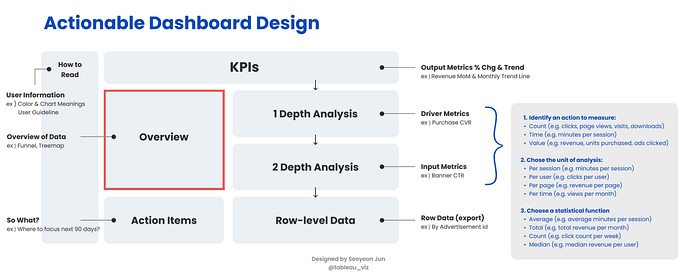 Data Overview
• High-Level Visualization: Use visual elements like funnel charts or treemaps to provide a broad overview of trends before users delve into specific details.
• Examples of Overview :
Data Overview
• High-Level Visualization: Use visual elements like funnel charts or treemaps to provide a broad overview of trends before users delve into specific details.
• Examples of Overview :
 (View Highlight)
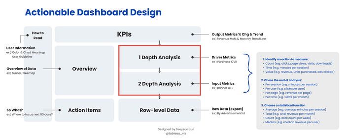 In-Depth Analysis
Layered Analysis: Structure your analysis in layers:
In-Depth Analysis
Layered Analysis: Structure your analysis in layers:
 (View Highlight)
 Data Range Filter of Digital Ads Performance Dashboard (By Seoyeon Jun)
Ensure that users can interact with these sections, filtering and drilling down into the data as needed.
Data Range Filter of Digital Ads Performance Dashboard (By Seoyeon Jun)
Ensure that users can interact with these sections, filtering and drilling down into the data as needed.
 (View Highlight)
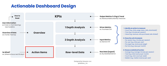 Actionable Insights
• Direct Connection: Dedicate a section to linking data with potential actions. Highlight areas that require attention and suggest recommendations based on observed trends.
• Examples of Actionable Insights : For example, you might include a table on the RFM Dashboard that displays only the customers from a specific segment for targeted marketing, or a table on the Sales Pipeline Dashboard that highlights the top-priority sales opportunities to focus on over the next 90 days. (View Highlight)
Actionable Insights
• Direct Connection: Dedicate a section to linking data with potential actions. Highlight areas that require attention and suggest recommendations based on observed trends.
• Examples of Actionable Insights : For example, you might include a table on the RFM Dashboard that displays only the customers from a specific segment for targeted marketing, or a table on the Sales Pipeline Dashboard that highlights the top-priority sales opportunities to focus on over the next 90 days. (View Highlight)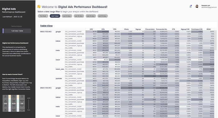 (View Highlight)